Why Illustrated and Interactive Maps Outperform Screenshots in Presentations

Maps are central to how we explain location, movement, reach, and opportunity. Yet many presentations still rely on static map screenshots—often clipped from mapping apps or reports—to communicate geographic information. While screenshots are quick to obtain, they are rarely effective. Illustrated and interactive maps consistently outperform screenshots in presentations because they are clearer, more persuasive, and better aligned with how audiences process information.
For businesses, planners, educators, and analysts, the difference is not cosmetic. It directly affects comprehension, engagement, and decision speed.
Screenshots Capture Data, Not Insight
A screenshot is a snapshot of someone else’s interface, designed for navigation—not communication. It includes default colors, extraneous labels, icons, and controls that are irrelevant to your message. The audience is forced to mentally filter noise before extracting meaning.
Illustrated maps, by contrast, are purpose-built. Every element exists to support a specific narrative. Roads are simplified, regions are emphasized, and only relevant points of interest remain. Instead of asking viewers to decode the map, illustrated maps guide them toward insight.
Illustrated Maps Improve Visual Hierarchy
Effective presentations depend on visual hierarchy—what the audience notices first, second, and third. Screenshots offer no such hierarchy. All elements carry roughly equal visual weight, which overwhelms the viewer.
Illustrated maps deliberately control attention:
- Primary locations are highlighted
- Secondary context is muted
- Supporting details appear only where needed
This hierarchy allows presenters to tell a clear geographic story without verbal over-explanation. Viewers intuitively understand where to look and what matters most.
Custom Illustration Aligns Maps With Your Message
Screenshots reflect the priorities of the platform they come from, not your objective. A navigation app prioritizes turn-by-turn clarity, not strategic storytelling. A satellite image prioritizes realism, not abstraction.
Illustrated maps can be tailored to:
- A sales pitch
- A boardroom strategy discussion
- An investor presentation
- A classroom explanation
Colors, labels, boundaries, and symbols can all be aligned with brand identity and presentation tone. This alignment strengthens credibility and makes the map feel like an integrated part of the story, not an afterthought.
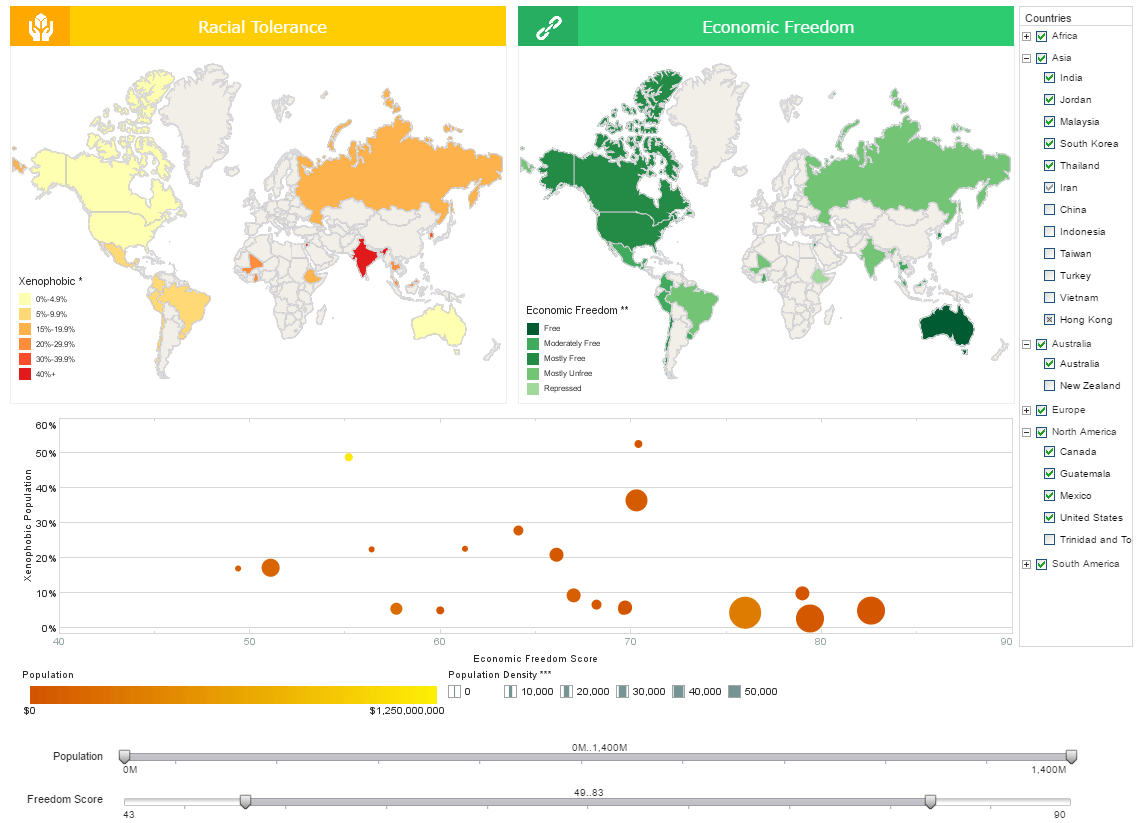
Interactive Maps Turn Passive Viewing Into Engagement
One of the biggest limitations of screenshots is that they are passive. The audience looks, absorbs what it can, and moves on. Interactive maps change this dynamic completely.
With interactive maps, viewers can:
- Hover to reveal additional context
- Toggle layers on and off
- Zoom into areas of interest
- Filter data by category or time
This interaction transforms the audience from observers into participants. In business settings, this leads to deeper engagement and more productive discussions. Instead of asking the presenter for clarification, stakeholders explore answers themselves in real time.
Better Handling of Complex Data
As data density increases, screenshots fail quickly. Trying to show customer density, performance metrics, infrastructure, and growth corridors on a static screenshot often results in clutter and confusion.
Interactive maps solve this by layering information:
- Base geography stays constant
- Data layers can be revealed progressively
- Complexity is managed without overwhelming the viewer
Illustrated design ensures that even when data is layered, clarity is preserved. This is especially valuable in analytics-heavy presentations where multiple variables must be explained together.
Improved Accuracy and Reduced Misinterpretation
Screenshots are often misleading by accident. Cropped views remove scale context, zoom levels distort distances, and default projections can exaggerate or minimize regions unintentionally.
Illustrated maps are built with intent:
- Scale is chosen deliberately
- Distances can be labeled accurately
- Boundaries are clearly defined
This reduces the risk of misinterpretation—critical in business, policy, and planning presentations where decisions carry real consequences.
Stronger Emotional and Narrative Impact
People do not just process maps analytically; they respond emotionally to them. Illustrated maps use design language—color, spacing, iconography—to evoke clarity, opportunity, or urgency.
Interactive elements further reinforce narrative flow. As the presenter moves through a story, the map evolves alongside it. This synchronized storytelling is impossible with static screenshots, which remain visually frozen regardless of the discussion.
Superior Performance in Digital and Remote Settings
Modern presentations are increasingly delivered over video calls, shared screens, and mobile devices. Screenshots often degrade badly in these environments—text becomes unreadable, details blur, and clutter intensifies.
Illustrated maps are optimized for presentation contexts:
- Larger, legible labels
- Simplified geometry
- Clear contrast at different screen sizes
Interactive maps excel even further, allowing viewers to explore independently rather than relying on a presenter’s cursor movements.
Brand and Professionalism Matter
A screenshot immediately signals “borrowed” content. It subtly undermines professionalism, especially in high-stakes contexts like investor pitches, client proposals, or executive briefings.
Illustrated and interactive maps signal:
- Preparation
- Intentional design
- Ownership of the narrative
They elevate the perceived quality of the entire presentation, often influencing how the message—and the presenter—are judged.
When Screenshots Still Make Sense
Screenshots are not always wrong. They can be useful for:
- Quick internal discussions
- Demonstrating how an app works
- Capturing real-time conditions
However, the moment the goal shifts to persuasion, explanation, or decision-making, screenshots become a liability rather than an asset.
Final Thoughts
The purpose of a presentation map is not to show geography—it is to communicate meaning through geography. Screenshots show what exists; illustrated and interactive maps explain why it matters.
By offering clarity, engagement, accuracy, and narrative control, illustrated and interactive maps consistently outperform screenshots. For anyone serious about using maps as communication tools, the choice is clear: design for understanding, not convenience.
