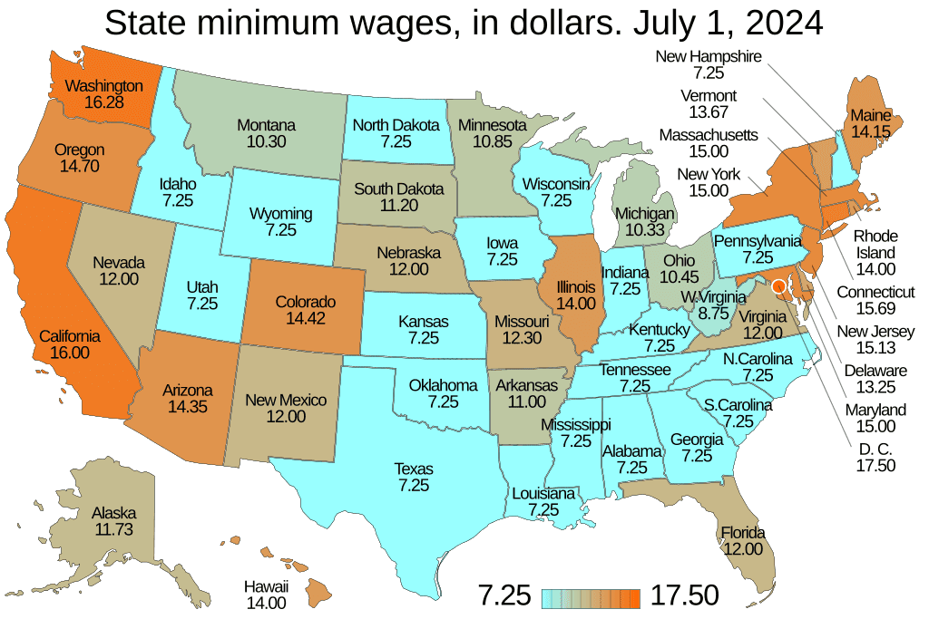

Choropleth maps are a compact way to translate messy regional data into a single, persuasive visual. For seed-stage startups pitching investors, a well-crafted choropleth can turn abstract market size talk into a clear geographic story about opportunity, prioritization, and scale. This article explains why startups use choropleths for TAM, how to design them for investor decks, common pitfalls to avoid, and two practical map patterns founders can use immediately.
Why choropleth maps matter for TAM
Investors evaluate TAM as both a number and a narrative. A numeric TAM alone is easy to dismiss as an optimistic projection. Placed on a map, the same number acquires spatial logic. A choropleth turns regional concentrations into visible patterns, which helps investors assess:
- Market clustering – Is demand concentrated in a few dense metros or spread thinly across many states?
- Go-to-market fit – Where should a small sales team target first to maximize impact?
- Operational feasibility – Which regions are reachable with existing logistics or partnerships?
For seed-stage startups, the goal is not to prove absolute precision. It is to show that the founder understands where customers are, why those places matter, and how early growth will scale geographically.
One map, one message
The best choropleth in a pitch deck has a single, explicit message. Before designing the map, answer this question in one sentence: What should an investor understand from this slide in under 10 seconds?
Examples of single-message titles:
- “TAM concentrated in five high-value states”
- “Top 20 counties account for 65 percent of addressable demand”
- “Urban corridors represent our initial $X million opportunity”
Put that sentence in the slide title. The map should simply prove the statement, not hide it among visual clutter.
Data choices that matter
A choropleth only communicates what you feed it. Good data decisions for TAM maps include:
- Use the right geographic unit. States work for national context. Metros or counties work when total addressable demand is concentrated in urban centers. Choose the unit that matches your go-to-market model.
- Normalize where appropriate. Raw counts can mislead. For example, revenue per capita or penetration rate often reveals where your product fits best. If your service is B2B, normalize by number of target businesses per region rather than population.
- Aggregate to remove noise. Seed decks benefit from clarity. Aggregate point-level signals into meaningful buckets so the map shows clear tiers rather than a noisy gradient.
Always be ready to provide the underlying methodology in an appendix or data slide. Investors will ask, but the main slide should stay crisp.
Design rules for investor-ready choropleths
- Limit the number of color classes – 3 to 5 is ideal. Fewer classes make tiers readable at a glance.
- Use a single, brand-aligned accent color for high-value areas and neutral grays for context. Avoid rainbow scales that create visual confusion.
- Avoid fine gradients that disappear when the deck is exported to PDF or viewed on a projector. Test the map in the final format.
- Include a short, readable legend and, where possible, label the top 3 states or metros by name and value. Investors will focus on the extremes.
- Provide an inset or zoom where needed. If a metro cluster drives most of the TAM, show a state-level map plus a focused inset for the metro.
- Make the title a conclusion, not a description. The title should not read “TAM by state.” It should read “70 percent of TAM concentrated in the Northeast corridor.”
Two high-leverage choropleth patterns for seed decks
Pattern A – National TAM Tier Map
- Use state-level choropleth with 4 tiers: Core, Strong, Emerging, Low.
- Core states are where initial traction, partnerships, or pilot customers exist.
- Strong states have demographic or industry alignment but require execution.
- Use subtle hatching or annotation to mark states where pilots are planned.
Why it works: Investors see where you will focus limited resources first and why that focus is rational.
Pattern B – Metro Heat + State Context
- Primary map: choropleth by metro-area penetration or potential.
- Secondary element: small state-level choropleth or sparkline to show statewide totals.
- Highlight the top 10 metros with labels and numeric callouts.
Why it works: For startups selling into B2B or urban consumers, metro-level granularity demonstrates tactical realism for sales planning.
Common mistakes founders make
- Showing raw counts without normalization. Large population states dominate raw maps even if they are poor product-market fits.
- Using too many colors or fine gradients. Investors should not have to squint to see tiers.
- Overclaiming precision. Seed-stage TAMs are directional. Avoid implying false exactness with overly granular choropleths.
- Forgetting the narrative. A great map supports a clear ask: hire X salespeople in Y markets, or raise $Z to enter the top 5 metros.
How to defend your map to investors
Have a one-slide appendix with methodology. Include:
- Data sources (public datasets, proprietary CRM, market reports)
- Geographic unit definitions and any normalizations applied
- Timeframe of data and key assumptions
Be transparent about limitations. Investors respect founders who know the bounds of their data.
When to use interactive choropleths
Interactive maps belong in product demos, investor data rooms, or one-on-one follow-ups. Use interactivity to let sophisticated investors drill into regions for proof points. For the live deck, default to static, high-resolution choropleths that convey the message instantly.
Example narrative flow in a deck
- Problem slide with customer pain described nationally.
- Choropleth TAM slide with title that states the main takeaway.
- Follow-up slide listing top 10 metros with brief on-the-ground evidence.
- Roadmap slide showing where pilots and hires will happen first.
This sequence turns a large abstract TAM into a practical go-to-market plan.
Final checklist before you present
- Title states the conclusion.
- Map is readable at projector resolution and in PDF.
- Top regions are labeled and match your pitch narrative.
- Appendix contains data sources and methods.
- You can explain why you chose that geographic unit in one sentence.
Conclusion
For seed-stage startups, choropleth maps are more than decoration. They are a way to make TAM tangible and to demonstrate spatial thinking that underpins a credible go-to-market plan. Used properly, choropleths show that a founder understands where demand clusters, why certain markets matter, and how limited resources can capture meaningful share. Build the map around the decision you want investors to make, keep the visual language simple, and be transparent about data. Do that, and a single slide can convert a large-sounding TAM number into a focused, fundable plan.