US tech audiences are among the most data-literate in the world. Product managers, engineers, operators, founders, analysts, and investors interact with dashboards daily. They are comfortable with charts, tables, and metrics—but they are also increasingly exposed to interactive maps as products become more location-aware.
This raises a recurring question for SaaS teams, startups, and data platforms: when should you use interactive maps, and when are static charts the better choice? The answer is not about preference or aesthetics. It’s about how different visual tools support cognition, decision-making, and trust among US tech audiences.
How US Tech Audiences Consume Data
Before comparing tools, it’s important to understand the audience.
US tech users typically:
- Scan dashboards quickly
- Expect immediate signal clarity
- Are skeptical of visual fluff
- Value speed, precision, and actionability
They do not want to explore for fun. They want to understand what’s happening and what to do next. Any visualization that slows that process—interactive or static—will be rejected.
What Static Charts Do Exceptionally Well
Static charts remain foundational for a reason. They excel at communicating precise comparisons and temporal trends.
Strengths of Static Charts
Static charts work best when the question is:
- How did a metric change over time?
- How do categories compare numerically?
- Is performance up or down?
Line charts, bar charts, and area charts are:
- Fast to read
- Familiar to all tech roles
- Highly precise
For KPIs like revenue growth, latency, conversion rates, or system uptime, static charts often outperform maps. They reduce ambiguity and cognitive load.
Why Tech Audiences Trust Charts
US tech audiences associate charts with:
- Analytical rigor
- Quantitative accuracy
- Engineering discipline
Charts feel deterministic. There is little room for interpretation. This makes them ideal for performance reviews, investor updates, and operational monitoring.
Where Static Charts Start to Break Down
Charts struggle when space matters.
They perform poorly when:
- Geography influences outcomes
- Context changes by region
- Patterns are spatial rather than numeric
For example:
- A bar chart can show sales by state, but not why certain states outperform
- A line chart can show delivery delays, but not where bottlenecks cluster
At this point, US tech users are forced to mentally reconstruct geography—a slow and error-prone process.
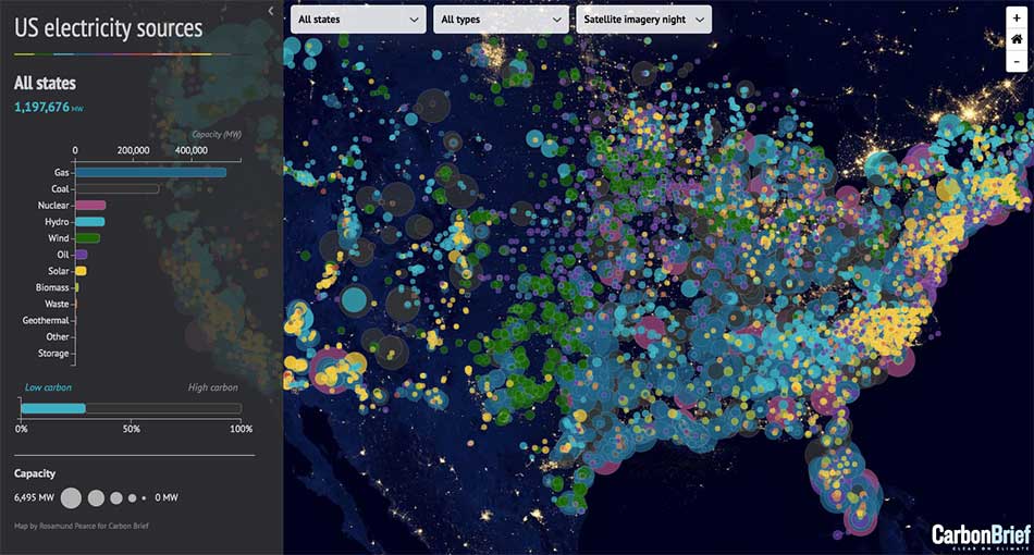
What Interactive Maps Do Better Than Charts
Interactive maps excel when location is a first-class variable.
Strengths of Interactive Maps
Maps answer questions like:
- Where are problems concentrated?
- Which regions behave differently?
- How does context change across space?
They reveal:
- Clusters
- Outliers
- Coverage gaps
- Spatial relationships
US tech audiences process spatial patterns faster visually than numerically. A well-designed map can replace multiple charts and tables with a single glance.
Why Interactivity Matters Specifically
Static maps help, but interactivity is what makes maps truly valuable for tech users.
Interactive maps allow users to:
- Zoom between strategic and operational views
- Filter by time, segment, or status
- Drill into anomalies
This aligns with how US tech teams work: broad scan first, investigation second.
Unlike charts—which often require switching views—interactive maps let users stay in one mental frame while exploring multiple dimensions.
The Cognitive Difference: Sequential vs Parallel Understanding
Charts enforce sequential reading:
- Read axis
- Compare bars
- Interpret deltas
Maps enable parallel perception:
- Patterns emerge instantly
- Relationships are seen, not calculated
For tech audiences dealing with complex systems—networks, logistics, distributed users—parallel understanding is often more valuable than numeric precision.
This is why maps feel “intuitive” when designed well and “confusing” when overloaded.
When Interactive Maps Fail for Tech Audiences
Despite their strengths, maps can fail badly if misused.
Common failure modes include:
- Too much visual detail
- Poor color encoding
- Slow performance
- Unclear interaction affordances
US tech audiences are unforgiving of:
- Laggy maps
- Decorative geography
- Interactions that don’t lead to action
If a map looks impressive but does not answer a concrete question quickly, it loses trust faster than a bad chart.
Precision vs Context: The Core Trade-Off
At the heart of the debate is a trade-off:
- Charts optimize for precision
- Maps optimize for context
US tech audiences need both—but not at the same time.
For example:
- Use charts to show how much performance changed
- Use maps to show where that change occurred
The mistake is forcing one tool to do the other’s job.
Why the Best Products Use Both—Strategically
The most successful US tech products do not choose between maps and charts. They sequence them.
A common best-practice pattern:
- Map for situational awareness
- Chart for quantitative validation
- Workflow for action
This layered approach respects how tech users think:
- First: identify anomalies
- Second: measure impact
- Third: respond
Maps and charts become complementary, not competing.
Audience Seniority Matters
Another critical factor: who is looking at the data.
- Executives prefer maps for high-level understanding
- Operators prefer charts for precise tracking
- Analysts want both
US tech teams increasingly design role-based dashboards where:
- Maps dominate overview screens
- Charts dominate drill-down views
This alignment improves adoption and reduces friction.
Interactivity as a Signal of Product Maturity
Among US tech audiences, interactivity is also a credibility signal.
A thoughtful interactive map suggests:
- The team understands real-world complexity
- The product is built for scale
- Data is structured, not improvised
However, unnecessary interactivity signals the opposite: confusion about priorities.
The Key Question to Ask Before Choosing
US SaaS teams that make good visualization decisions ask one question before building:
“What decision should this visualization make easier?”
If the answer is:
- “Compare exact values” → use charts
- “Understand spatial patterns” → use maps
- “Investigate anomalies” → use both
This framing prevents design-by-preference and anchors visuals in outcomes.
Conclusion: What Actually Works for US Tech Audiences
Interactive maps and static charts are not rivals—they are tools optimized for different cognitive tasks.
For US tech audiences:
- Static charts win on precision, speed, and trust
- Interactive maps win on context, pattern recognition, and system-level insight
The most effective products use maps to reveal where and charts to explain how much. When combined thoughtfully, they turn raw data into clear, confident decisions.
For mapsandlocations.com, this distinction is central: the future of data communication is not about choosing visuals—it’s about designing the right visual for the right decision at the right moment.