
Map Projections Explained: Why Your World Map Might Be Lying to You


Most people trust maps instinctively. A world map feels authoritative, objective, and factual. Yet almost every world map you have ever seen is lying to you in subtle but important ways. Not because the cartographer intended deception, but because translating a spherical planet onto a flat surface always involves compromise.
For business leaders, designers, analysts, and executives, misunderstanding map projections leads to distorted perception, flawed comparisons, and poor communication. This article explains what map projections are, why distortion is unavoidable, how common projections mislead interpretation, and why this matters far beyond geography classrooms.
Why projections exist in the first place
The Earth is roughly spherical. Screens, paper, and slides are flat.
A map projection is the mathematical method used to transform the curved surface of the Earth into a flat representation. During that transformation, something must give. No projection can preserve all of the following at once:
- Area
- Shape
- Distance
- Direction
Every projection chooses which properties to preserve and which to distort. The lie is not that maps are wrong. The lie is that they are neutral.
The Mercator projection and its hidden bias
The most familiar world map uses the Mercator projection. It was created in the 16th century for navigation, not comparison.
Mercator preserves direction. This made it extremely useful for sailors following compass bearings. What it does not preserve is area.
As you move away from the equator, land masses stretch dramatically. This causes:
- Greenland to appear comparable in size to Africa
- Europe to look much larger relative to South America
- Northern regions to feel more dominant than they are
In reality, Africa is about fourteen times larger than Greenland. On a Mercator map, that truth is visually erased.
For navigation, this distortion is acceptable. For understanding the world, it is deeply misleading.
Why your brain believes the map
Humans interpret size visually before analytically. When something looks bigger on a map, it feels more important.
This creates subconscious bias:
- Large-looking countries feel dominant
- Smaller-looking regions feel marginal
- Northern regions feel central
- Equatorial regions feel secondary
These perceptions influence how people reason about economics, population, risk, and opportunity, even when the data says otherwise.
The projection shapes the story before any numbers are discussed.
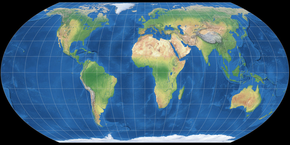
Equal-area projections tell a different truth
Equal-area projections are designed to preserve relative size. When countries are shown in correct proportion, the world looks unfamiliar to many viewers.
Africa becomes enormous. Europe shrinks. South America regains presence. Southeast Asia feels far more significant.
Nothing changed about the data. Only the projection changed. Yet the interpretation shifts immediately.
This is why world maps can feel like they are lying. They are not just showing geography. They are shaping mental models.
Distortion is unavoidable, but choice is not
It is important to be precise here.
All map projections distort something. There is no perfect projection. The problem arises when the distortion conflicts with the purpose of the map.
A projection designed for navigation should not be used for:
- comparing markets
- explaining global opportunity
- showing relative impact
- communicating risk distribution
When the wrong projection is used, the map stops informing and starts misleading.
Where this causes real business problems
Global market size comparisons
When companies show global TAM on a Mercator-style world map, regions near the equator often appear visually smaller than regions at higher latitudes.
This can:
- understate emerging markets
- overemphasize smaller but visually inflated regions
- skew executive attention before discussion even begins
The numbers may be correct. The perception is not.
Risk and exposure mapping
Maps showing geopolitical, climate, or supply chain risk often rely heavily on area-based color fills.
If the projection inflates certain regions, perceived risk concentrates visually where it should not. This can subtly influence strategic priorities.
International presentations
Executives and stakeholders from outside North America and Europe are increasingly sensitive to how their regions are represented.
A distorted world map can feel outdated, biased, or careless, even if no offense was intended.
In global business contexts, projection choice is also a credibility signal.
Why most tools default to misleading projections
Many digital mapping tools default to Mercator or similar projections because:
- they work well for zooming and panning
- they align with web mapping standards
- they simplify engineering complexity
These defaults are convenient, not communicative.
When teams export maps directly from tools into decks or reports, the projection comes along silently. No one questions it, and the distortion becomes part of the message.
The executive problem: perception beats explanation
Executives do not analyze maps line by line. They scan them.
In the first few seconds, they form impressions about:
- balance
- dominance
- concentration
- scale
If a map visually contradicts their intuition, discussion derails. If it quietly reinforces a distorted view, decisions may be biased without anyone realizing why.
This is why projection choice matters in presentations, not just textbooks.
Choosing the right projection for the job
The correct projection depends on the question you are answering.
General guidance:
- Use equal-area projections when comparing size, volume, or distribution
- Use navigation-focused projections only for navigation
- Avoid default world maps for strategic comparison
- Match projection choice to the story you are telling
For national or regional maps, especially in the United States context, purpose-built projections often reduce distortion significantly compared to global defaults.
Design techniques that reduce projection bias
Even when projection options are limited, designers can mitigate distortion by:
- avoiding world maps when regional maps suffice
- using insets for important but visually compressed regions
- emphasizing business importance with annotations, not land area
- reducing reliance on area alone to communicate value
These techniques do not fix projection distortion, but they reduce its ability to mislead.
A simple test to detect a lying map
Ask one question:
“If a region looks large on this map, is it actually important for the decision being made?”
If the answer is no, the projection or framing is wrong.
Maps should support reasoning, not shortcut it.
Conclusion: maps tell stories before data speaks
Map projections are not technical trivia. They are narrative choices.
A world map always tells a story about importance, balance, and centrality before a single number is read. When that story conflicts with reality, the map is lying, even if the data is accurate.
At mapsandlocations.com, we treat projection choice as a core communication decision. The goal is not cartographic purity. The goal is visual honesty.
If you want, we can review your global or regional maps and identify where projection choice is distorting interpretation, then redesign them so geography supports the story you actually intend to tell.